| Oracle® Database Application Express Advanced Tutorials Release 3.0 Part Number B28842-01 |
|
|
View PDF |
| Oracle® Database Application Express Advanced Tutorials Release 3.0 Part Number B28842-01 |
|
|
View PDF |
Data and form elements in an Oracle Application Express application are placed on a page using containers called regions. There are several attributes that control the placement and positioning of regions on pages. In turn, you control the placement and style of form elements (called items) inside of regions using item attributes.
In this tutorial, you create the underlying data objects for a data input form by running a script. Then, you create a data input form and learn how to change the form layout by altering region and item attributes.
This section contains the following topics:
The first step in creating a data input form is to create the underlying data objects. In this exercise, you create a table named HT_EMP and then use a wizard to create a new page.
Topics in this section include:
First, you create a new table by running a script in SQL Scripts.
To create the HT_EMP table and the appropriate associated objects:
On the Workspace home page, click SQL Workshop and then SQL Scripts.
The SQL Scripts home page appears.
Click Create.
The Script Editor appears.
In Script Name, enter HT_EMP.
In the Script Editor, enter the following data definition language (DDL):
CREATE TABLE ht_emp (
   emp_id                 NUMBER       primary key,
   emp_first_name         VARCHAR2(30) not null,
   emp_middle_initial     VARCHAR2(1),
   emp_last_name          VARCHAR2(45) not null,
   emp_part_or_full_time  VARCHAR2(1)  not null check (emp_part_or_full_time in ('P','F')),
   emp_salary             NUMBER,
   emp_dept               VARCHAR2(20) check (emp_dept in ('SALES','ACCOUNTING',

'MANUFACTURING','HR')),
   emp_hiredate           DATE,
   emp_manager            NUMBER       references ht_emp,
   emp_special_info       VARCHAR2(2000),
   emp_telecommute        VARCHAR2(1) check (emp_telecommute in ('Y')),
   rec_create_date        DATE         not null,
   rec_update_date        date)
/

INSERT INTO ht_emp
   (emp_id, emp_first_name, emp_middle_initial, emp_last_name, emp_part_or_full_time, emp_salary, emp_dept, emp_hiredate, emp_manager, emp_special_info, emp_telecommute, rec_create_date)
VALUES
   (1,'Scott','R','Tiger','F',
    100000,'SALES',sysdate,null,'cell phone number is xxx.xxx.xxxx
home phone is yyy.yyy.yyyy','Y',
    SYSDATE)
/

CREATE SEQUENCE ht_emp_seq
   start with 2
/

CREATE OR REPLACE TRIGGER bi_ht_emp
      BEFORE INSERT ON ht_emp
      FOR EACH ROW
   BEGIN
      SELECT ht_emp_seq.nextval
        INTO :new.emp_id
        FROM DUAL;
      :new.rec_create_date := SYSDATE;
   END;
/

CREATE OR REPLACE TRIGGER bu_ht_emp
      BEFORE UPDATE ON ht_emp
      FOR EACH ROW
   BEGIN
      :new.rec_update_date := SYSDATE;
   END;
/
Click Save.
The script appears in the SQL Scripts Repository.
Run the HT_EMP script:
Click the HT_EMP script.
Click Run.
On the Run Script page, click Run again.
From the View list, select Details and click Go.
Figure 5-1 Details View in the Manage Script Results Page

Click the View Results icon to access the Results page.
Red text indicates errors while executing the file.
See Also:
"Using SQL Scripts" in Oracle Database Application Express User's Guide.Next, create a new application.
To create an application:
Return to the Workspace home page. Click the Home breadcrumb link at the top of the page.
On the Workspace home page, click the Application Builder icon.
The Application Builder home page appears.
Click Create.
Select Create Application and click Next.
For Name, specify the following:
Name - Enter Form Layout.
Application - Accept the default.
Create Application - Accept the default, From scratch.
Schema - Select the schema where you installed the OEHR sample objects.
Click Next.
Next, you need to add pages. You have the option of adding a blank page, a report, a form, a tabular form, or a report and form. For this exercise, you add two blank pages.
Add a blank page:
Under Select Page Type, accept the default, Blank, as shown in Figure 5-2.
Click Add Page.
The blank page appears at the top of the page.
Click Next.
For Tabs, accept the default, One Level of Tabs, and then click Next.
For Copy Shared Components from Another Application, accept the default, No, and click Next.
For Attributes, accept the defaults for Authentication Scheme, Language, and User Language Preference Derived From and then click Next.
For User Interface, select Theme 12 and then click Next.
Review your selections and click Create.
The Application home page appears. Note that your application contains two pages.
Next, create a new form using the Form on a Table or View Wizard.
To create a data input form:
On the Application home page, click Create Page.
For Page, select Form and click Next.
On Create Page, select Form on a Table or View and click Next.
For Table/View Owner, accept the default and click Next.
For Table/View Name, select the HT_EMP table and click Next.
For Page and Region Attributes:
Page Number - Enter 2.
Page Name - Enter Form Layout.
Region Title - Enter Form Layout.
Region Template - Accept the default.
Breadcrumb - Accept the default.
Click Next.
For Tab, accept the default, Do not use tabs, and click Next.
For Primary Key, accept the default and click Next.
Note that the wizard reads the primary key from the database definition.
For Source Type, accept the default Existing Trigger and click Next.
For Select Columns, select all the columns. Press SHIFT, select the first column and then the last one. Then, click Next.
For Process Options, accept the defaults and click Next.
For Branching, enter 2 (the page you are creating) in both fields and click Next.
Since this page is just for demonstration, you will not be utilizing branching.
Click Finish.
Click the Edit Page icon.
The Page Definition for page 2 appears.
Delete the following validation:
Under Page Processing, Validations, select P2_REC_CREATE_DATE not null.
Click Delete.
You are removing this validation because the value of this column is set using a trigger. The item will have no value in the form for a new record. This validation was automatically created because the underlying database column is not null.
Once you create a new input form, the next step is to run the page.
To run the page from the Page Definition:
Click the Run Page icon in the upper right corner as shown in Figure 5-3.
If prompted for a user name and password, enter your workspace user name and password and click Login. See "About Application Authentication".
The application appears.
As shown in Figure 5-4, the new form appears. Note that the form contains basic employee details and includes select lists, text areas, and display only items.
By default, the Primary Key column does not display since it is assumed that the primary key is system generated. In reality, the primary key is included in the page, but appears as a hidden item.
Notice that the page defaults with one item for each row and labels display to the left of the items. The item labels default to the column names with initial capitalization and with the underscores (_) replaced with spaces. You can override this default behavior by configuring user interface defaults for the table.
See Also:
"Managing User Interface Defaults" in the Oracle Database Application Express User's Guide.Also notice that items based on date columns default to include a date picker. Lastly, notice that the Emp Special Info item was created as a text area because of the size of the base column. This item type is a better choice for large text items since it allows the input text to wrap.
A region is an area on a page that serves as a container for content. You can alter the appearance of a page by changing the region attributes.
Topics in this section include:
To edit the region title and other region level attributes:
Click Edit Page 2 on the Developer toolbar.
Under Regions, click Form Layout.
The Region Definition appears.
Change the Title to Employee Info.
Click Apply Changes at the top of the page.
From the Page Definition, click the Run Page icon in the upper right corner.
Note the new region title.
To change other region attributes:
Return to the Page Definition. Click Edit Page 2 on the Developer toolbar.
Under Regions, click Employee Info.
The Region Definition appears.
Scroll down to User Interface.
You can control the position of a region within a page template by changing the page template.
From Display Point, select Page Template Region Position 3.
In this instance, your selection moves the region to the right side of the page. The region display points are determined by the page level template. If you do not select a page level template, Oracle Application Express uses the default page level template defined in the current theme. You can view specific positions by selecting the flashlight icon to the right of the Display Point list.
Next, temporarily change the region template.
From Template, select Borderless Region.
Click Apply Changes at the top of the page.
From the Page Definition, click the Run Page icon in the upper right corner.
The form appears as shown in Figure 5-5.
Figure 5-5 Employee Info Form with New Display Point and Template
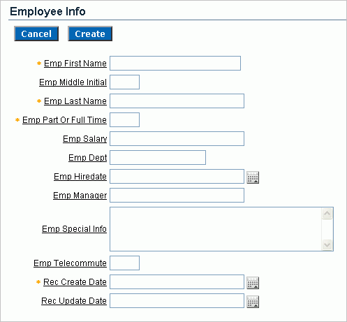
Note the changes in the appearance of the form. The form title displays in a dark color on a white background and has a rule beneath it. Also, note that there is no longer a border around the form.
To return to the region template and display point to the original selections:
Click Edit Page 2 on the Developer toolbar.
Under Regions, select Employee Info.
Scroll down to User Interface.
From the Template list, select Form Region.
From the Display Point List, select Page Template Body (3. Items above region content).
Click Apply Changes at the top of the page.
An item is part of an HTML form. An item can be a text field, text area, password, select list, check box, and so on. Item attributes control the display of items on a page. Item attributes determine where a label displays, how large an item will be as well as whether the item displays next to or below a previous item. You can change multiple item labels at once on the Page Items summary page.
Topics in this section include:
See Also:
"Creating Items" in Oracle Database Application Express User's Guide.To edit all item attributes:
On the Page Definition for page 2, locate the Items section.
Under Items, click the Edit All icon.
The Edit All icon resembles a small grid with a pencil on top of it as shown in Figure 5-6.
The Page Items summary page appears.
You change how a page appears by editing the item attributes. Common item attribute changes include:
Changing item labels by editing the Prompt field.
Placing more than one item in certain rows to group like items together. For example, you could group all items that make up an employee's name.
Changing the item width. Many items display better when they have a width that is less than the maximum. To change the item width, enter a new value in the Width field.
Reordering the items. The initial order of items is based on the order of the columns in the table on which the region is based. To reorder items, enter a new value in the Sequence field.
To see the how item attributes affect page layout, make the following changes:
Change the values in the Prompt, New Line, and Width fields to match those in Table 5-1:
Table 5-1 New Prompt, New Line, and Width Field Values
| Prompt Field | New Line | Width |
|---|---|---|
|
Emp ID |
Yes |
30 |
|
First Name |
Yes |
15 |
|
Middle Initial |
No |
2 |
|
Last Name |
No |
15 |
|
Part or Full Time |
Yes |
2 |
|
Salary |
Yes |
10 |
|
Department |
Yes |
15 |
|
Hire Date |
Yes |
10 |
|
Manager |
No |
15 |
|
Special Information |
Yes |
60 |
|
Telecommute |
Yes |
2 |
|
Record Create Date |
Yes |
10 |
|
Record Update Date |
Yes |
10 |
Click Apply Changes.
Click the Run Page icon in the upper right corner of the page.
Figure 5-7 Employee Info Form After Editing the Prompt, New Line, Width Attributes
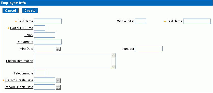
As shown in Figure 5-7, note that some items are pushed too far to the right because of the width of the Special Information item. Oracle Application Express lays out regions as tables, and the width of each column is determined by the largest display width of the items in that column.
There are several approaches to fixing item alignment:
For the items Middle Initial, Last Name and Manager items, set New Field to equal No.
This places the items directly after the items they follow, but in the same column. This approach is best used for positioning embedded buttons next to items. Note that this setting can make text items appear squashed.
Change the Column Span field of the Special Information item.
For example, setting the Column Span for the Special Information item to 5 would enable multiple items to display above and below it. This change causes five items to display above Special Information (First Name, Middle Initial, and Last Name).
Be aware, however, that using Column Span to fix the display of the name does not result in a consistent layout. The Manager item would still be in the same column as Middle Initial. Because the Manager item is larger than Middle Initial, Last Name would still be pushed too far to the right. To fix this, you could change the Column Span of the Manager item to 3 so it displays above Special Information.
Reset the column width in the middle of the region by adding an item of type Stop and Start HTML Table. This forces the close of an HTML table using the </table> tag and starts a new HTML table. Inserting a Stop and Start HTML Table item just after the Last Name item results in an even layout. Note that a Stop and Start HTML Table item only displays its label. You can prevent the label from displaying at all by setting it to null. To do this, you simply remove the defaulted label.
You can use the Drag and Drop Layout page to interactively reorder items within a given region, change select item attributes, create new items, or delete existing items. For this exercise, you will reorder two items.
To add a Stop and Start HTML Table item:
Click Edit Page 2 on the Developer toolbar.
Under Items, click the Drag and drop icon as shown in Figure 5-8.
The Drag and Drop Layout page appears. This page is divided into the Item palette on the left and the Layout region on the right.
In the Item palette, select the Stop and start table icon and drop it after the row containing the P2_EMP_ID item:
Move your mouse over the icons in the Item palette and locate the Stop and start table. Note that when you position the cursor over an item type, a tooltip appears.
Figure 5-10 Stop and Start Table Item Type
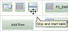
Click the Stop and start table icon and drag it beneath of P2_EMP_ID.
Click Next.
A report appears. Note that the new Stop and Start HTML Table appears beneath P2_EMP_ID.
Figure 5-11 Revised Drag and Drop Layout Page
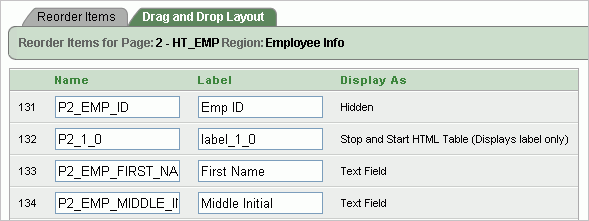
Click Apply Changes.
Items are laid out in HTML tables. Next, you need to edit the Column Span attribute for the Special Information item. The Column Span attribute defines the value to be used for the COLSPAN attribute in the table cell.
To edit the Special Information item:
Under Items, click the Reorder Region Items icon.
The Reorder Region Items icon resembles a light green down and up arrow as shown in Figure 5-12.
The Reorder Region Items page appears in a separate window.
Items on a page are laid out in tables. You can edit the position of an item by selecting values for the New Line, New Field, Column Span, and Label Alignment attributes. You can change the order in which items display by clicking the up and down arrows in the far right column. Also notice that a graphical representation of how the items display appears at the bottom of the page.
For Special Information, change the Column Span to 3 and click Apply Changes.
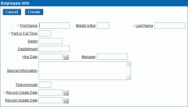
Click the Run Page icon in the upper right corner. The form appears as shown in Figure 5-13.
Figure 5-13 Employee Info Form with Corrected Item Alignment
There are two columns in the HT_EMP table for auditing, Record Create Date and Record Update Date. Because the values of these columns are set with triggers, these columns should not be updatable by users. This exercise demonstrates how to make items display-only and then how to add them to their own region.
Topics in this section include:
To make the item P2_REC_CREATE_DATE display-only:
Go to the Page Definition for page 2. Click Edit Page 2 on the Developer toolbar.
Under Items, select the item P2_REC_CREATE_DATE.
From the Display As list in the Name section, select Text Field (Disabled, saves state).
Click Apply Changes.
To make the item P2_REC_UPDATE_DATE display-only:
Go to the Page Definition for page 2.
Under Items, select the item P2_REC_UPDATE_DATE.
From the Display As list in the Name section, select Text Field (Disabled, saves state).
Click Apply Changes.
Next, create a new region and move the display-only items to the new region.
To create a new region:
Go to the Page Definition for page 2.
Under Regions, click the Create icon.
For Region:
Identify the type of region to add to this page - Accept the default, HTML, and click Next.
Select the type of HTML region container you wish to create - Accept the default, HTML, and click Next.
For Display Attributes, enter Audit Information in the Title field, accept the remaining defaults, and click Next.
Click Create Region.
To move the items to the new region:
Go to the Page Definition for page 2.
Under Items, click the Edit All icon. The Edit All icon resembles a small grid with a pencil on top of it.
The Page Items summary page appears.
For P2_REC_CREATE_DATE and P2_REC_UPDATE_DATE:
In the Prompt column, add a colon to the end of the label name.
In the Region column, select Audit Information.
Click Apply Changes.
Click the Run Page icon in the upper right corner.
Figure 5-14 demonstrates how these items would display in a running page.
The Hide/Show Region template enables the user to click a plus (+) sign to expand the contents of the region or click a minus (-) sign to hide the contents. By changing the region template to Hide/Show Region, users can decide whether they want to see the Audit Information region.
To change the region template to Hide/Show Region:
Go to the Page Definition for page 2.
Under Regions, click Audit Information.
Under User Interface, select Hide and Show Region from the Template list.
Click Apply Changes.
Click the Run Page icon in the upper right corner.
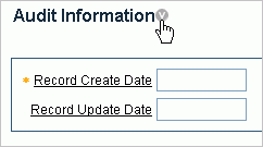
Figure 5-15 demonstrates how Audit Information displays as a Hide/Show region. You can hide the region by clicking the icon to the right of the region title.
Figure 5-15 Audit Information as a Hide/Show Region
Regions can have headers and footers. Headers and footers typically contain text or HTML that displays at either the top or bottom of the region.
To add a region footer:
Go to the Page Definition for page 2. Click Edit Page 2 on the Developer toolbar.
Under Regions, select Audit Information.
Scroll down to Header and Footer.
Enter the following in Region Footer:
<i>The Record Create Date is the date that the record was initially entered in
to the system. <br/>The Record Update Date is the date that the
record was last updated.</i>
Click Apply Changes.
Click the Run Page icon in the upper right corner.
Click the arrow next to Audit Information to display the two date fields and new footer text as shown in Figure 5-16.
Figure 5-16 Audit Information Region with Footer

As shown in Figure 5-16, the text of the footer is wrapped with the italic HTML tag and there is an imbedded break. Without the manual break, the text would take up the entire width of the region (as defined by region template).
To make a region conditional, you create a display condition for the Audit Information region so that it only displays if the Employee ID is not null. Since the Employee ID is set by a trigger, it only exists for records retrieved from the database. You can control the display of the Audit Information region by using a built-in condition that checks for the presence of a value for the item containing the Employee ID (that is, P2_EMP_ID)
To display the Audit Information region conditionally:
Go to the Page Definition for page 2.
Under Regions, select Audit Information.
The Region Definition appears.
Scroll down to Conditional Display.
Under Conditional Display:
From Condition Type, select Value of Item in Expression 1 is NOT NULL.
In Expression 1, enter:
P2_EMP_ID
Click Apply Changes.
You have the option of displaying regions in columns as well as in rows. This exercise explains how to create another region to display explanatory text (hints) for the user.
To create a region to display hint text:
Go to the Page Definition for page 2.
Under Regions, click the Create icon.
For Region:
Identify the type of region to add to this page - Accept the default, HTML, and click Next.
Select the type of HTML region container you wish to create - Accept the default, HTML, and click Next.
For Display Attributes:
Title - Enter Hint.
Region Template - Select Sidebar Region.
Display Point - Select Page Template Region Position 3.
Sequence - Accept the default.
Column - Select 3.
Click Next.
In Enter HTML Text Region Source, enter the following:
Use this page to enter and<br/>
maintain employee information.
Click Create Region.
Click the Run Page icon. Figure 5-17 shows the new Hint region on the page.
This exercise describes how to change item types to make data entry easier for the user. To change an item type, go to the Item attributes page and select another Display As option.
Topics in this section include:
Tip:
For simplicity, this tutorial has you alter items by editing item attributes. As a best practice, however, you can also create named LOVs and reference them.See Also:
"Creating Lists of Values" in Oracle Database Application Express User's GuideBecause the Part or Full-time item only has two valid choices, this item is a good candidate for either a check box or a radio group.
To change the Part or Full-time item to a radio group:
Go to the Page Definition for page 2. Click Edit Page 2 on the Developer toolbar.
Under Items, select P2_EMP_PART_OR_FULL_TIME.
The Edit Page Item page appears.
Locate the Name section. From the Display As list, select Radiogroup.
Locate the Label section. Specify the following:
Label - Remove the text in the Label field.
Template - Select No Label.
Under List of Values, create a static list of values. Specify the following:
Named LOV - Select Select Named LOV.
List of values definition - Enter:
STATIC:Full-time;F,Part-time;P
This definition will display as two radio buttons with the labels Full-time and Part-time, but the value being inserted into the database will be either F or P.
At the top of the page, click Apply Changes.
Click the Run Page icon in the upper right corner. The modified form appears as shown in Figure 5-18.
Figure 5-18 Part or Full-time item Changed to a Radio Group
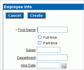
Notice that Full-time and Part-time displays as a radio group that is stacked in one column. You can have these buttons display side by side.
To display the Full-time and Part-time radio buttons side by side:
Go to the Page Definition for page 2.
Under Items, select P2_EMP_PART_OR_FULL_TIME.
Scroll down to List of Values.
In Number of Columns, enter 2.
At the top of the page, click Apply Changes.
Click the Run Page icon.
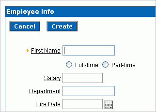
By changing this setting to match the number of valid values (that is, Full-time and Part-time), the values display side by side as shown in Figure 5-19.
Figure 5-19 Part or Full-time Item Displayed Side by Side
In the DDL you used to create the HT_EMP table, the Department is validated by a check constraint. You can implement the Department as a radio group, a select list, or a Popup LOV.
To change Department to a select list:
Go to the Page Definition for page 2. Click Edit Page 2 on the Developer toolbar
Under Items, select P2_EMP_DEPT.
From the Display As list in the Name section, select Select List.
The other Select List choices are for either redirecting the user to another page or URL based on the selection, or submitting the current page which is used when other information needs to be retrieved based upon the selection in the Select List.
Scroll down to List of Values.
Under List of Values, create a static list of values. Specify the following:
Named LOV - Select Select Named LOV
List of values definition - Enter:
STATIC:SALES,ACCOUNTING,MANUFACTURING,HR
From Display Null, select Yes.
In Null display value, enter:
- No Assignment -
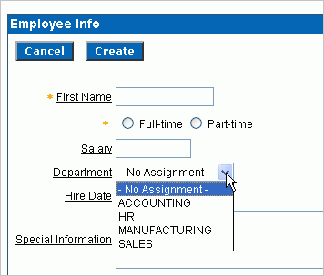
The last two selections take into account that the EMP_DEPT column can contain nulls. As a best practice, whenever you implement a select list and have a column that can be null, you should set Display Null to Yes. Failure to do so results in the item defaulting to the first item in the select list.
At the top of the page, click Apply Changes.
Click the Run Page icon.
The revised form appears as shown in Figure 5-20.
Figure 5-20 Department Changed to a Select List
The item Telecommute is ideal for a check box. When you change the Display Type, you can also move it up on the page and place it next to the Full-time and Part-time radio group.
To change Telcommute to a check box:
Go to the Page Definition for page 2. Click Edit Page 2 on the Developer toolbar.
Under Items, select P2_EMP_TELECOMMUTE.
From the Display As list in the Name section, select Checkbox.
Under Displayed, specify the following:
Sequence - Enter 136.
Begin on New Line - Select Yes.
Scroll down to List of Values.
To have the label precede the check box, specify the following:
Named LOV - Select Select Named LOV.
List of values definition - Enter:
STATIC:;Y
This List of values definition displays the check box after the label, but will not display a value associated with the check box. If the check box is checked, the value passed to the database will be Y.
At the top of the page, click Apply Changes.
Click the Run Page icon.
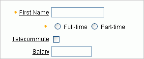
Note that the check box appears for Telecommute as shown in Figure 5-21.
Figure 5-21 Telecommute Field Changed to Check Box
You can control the look of an item label by using a label template. You can view the templates associated with the current theme on the Page Definition.
To view templates associated with the current theme:
Go to the Page Definition for page 2. Click Edit Page 2 on the Developer toolbar.
Locate the Shared Components area and note the Theme section as shown in Figure 5-22.
The current theme is Blue. In the Templates section, note that this theme includes two Label templates: Optional Label with Help and Required Label with Help.
The Required with Help label template prepends a yellow asterisk to the left of the item label. You can change the appearance of an item by selecting another template.
To change to a different label template:
Go to the Page Definition for page 2.
Under Items, select an item.
Scroll down to Label and make a selection from the Template list.
Click Apply Changes.
Run the page.
The wizard that created the form in this tutorial also created buttons. These buttons display conditionally based upon whether the page is being used to create a new record (that is, P2_EMP_ID equals null), or the page is being used to update an existing record. These buttons were created as HTML buttons and positioned at the top of the region.
You can also position buttons at the bottom of the region, to the left or right of the page title, above the region, below the region, or in any button position defined in the region template.
To change a button position:
Go to the Page Definition for page 2.
Under Buttons, click the Edit All icon in the Buttons section. The Edit All icon resembles a small grid with a pencil on top of it.
Make a new selection from the Position column.
Click Apply Changes.
Run the page.
Buttons can also have templates associated with them to refine how they look.
You can run the page and provide it with an Employee ID to retrieve. Typically, this would be done with a link from a report page; but for this example, run the page and add P2_EMP_ID:1 to the end of the URL as shown in the following example:
http://apex.oracle.com/pls/otn/f?p=9659:2:1284393467360777225::::P2_EMP_ID:1
This will pass the value 1 to the item P2_EMP_ID. If you run the page, note that the Delete and Apply Changes buttons now display as shown in Figure 5-23. The Create button appeared previously because the page was expecting a new record to be created. Also note that a value now appears in the Record Create Date field.
See Also:
"Understanding URL Syntax" in Oracle Database Application Express User's Guide.One way to make the information in a region easier to read is to make the labels (or the data) more pronounced. You can accomplish this by changing the color, specifying another font, or using bold. To make a label bold, you could bold the data manually, or create a new label template. In the latter approach, you would create a new label template that would wrap the HTML tag for bold around the label and then associate that template with the items in the Audit Information region.
To make data bold manually:
Go to the Page Definition for page 2.
Under Items, select an item name.
Scroll down to Element.
In HTML Form Element Attributes, enter:
class="fielddatabold"
This example references a class in the Cascading Style Sheet associated with this application.
Click Apply Changes.
Run the page.